Principles of Landscape Design
The basic principles of landscape design are an important set of standards that one should follow when possible. So, we've covered a lot of helpful design information already in this series, but these are the main foundations that lead to an overall unity and a more successful design.
Maybe you have an understanding of these principle already as they apply to designing in general, maybe you don't? At Dream Yard, we always try to take a slightly different approach to the same old stuff, so here is our take.
So you might be wondering how many principles of landscape design are there? Some books or websites will claim 5, others claim 7, or even more. Sometimes the terminology may differ and other times principles are blended together. The important thing is they all are providing good standards for evaluating your efforts to design effectively.
Keep in mind that not following all the principles doesn't necessarily make it a bad design, but certain violations should be avoided. That's why we started with the first section of this landscape design series with the focus on You.
My personal list contains 6, but I'll give you a couple more than that. We're only going to touch base on each one to give you a basic understanding and leave it to you to apply the principles you choose.
We already introduced you to one of the basic priciples of design in the last section. Balance. We'll cover 3 more of them now, and the rest in the last installment of the series.
“Variety may be the spice of life, but too many spices will confuse your taste buds.”
Dreamyard
Simplicity
I tell the above quote to my customers because it helps them to understand things better. A garden or yard is no different than creating a tasty dish, except it's the eye that gets confused instead of the taste buds. In order to maintain simplicity, you may have to exercise some restraint with your wants. Too many different plants, features, or colours, could negatively affect your design.
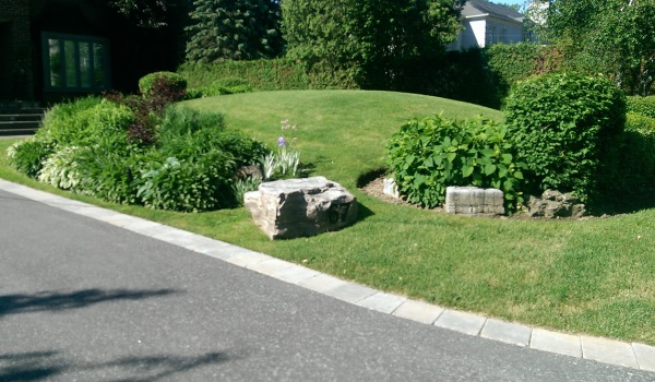
On the other hand, too much simplicity can lead to monotony without the right balance of variety. You can give a row of shrubs some variety by throwing in a small tree, large boulder, fountain, etc... You don't want to end up with a boring design. The easiest way to design a yard is to keep it simple to start with. You can always add things down the road if you like.
Having installed many landscape designs from paper, I'm going to reveal a secret that nobody tells you in their designing books or websites. The more landscape design simplicity you have, the easier it is to maintain a nice flow and transition between features. It may look great on paper, but when it comes time actually build it, it can sometimes be awkward. This means making modifications to the original design. Simplicity also allows your focal points to stand out better.
To put simplicity in the most “Simple” perspective, avoid
unnecessary change or excess
of any kind whether it be colour, shapes, or features.
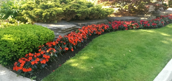
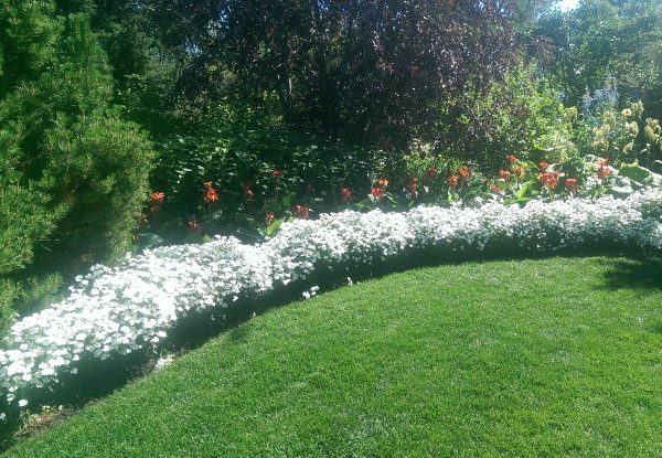 This lovely neutral white garden border is very simple with a touch of red on a mostly green pallet.
Landscape design and colour
So what do colours do? They can actually have multiple functions in the landscape. First of all they can represent and create moods and feelings. They can draw or catch the eye. They can create dimension. Bright colours (Red, yellow, orange, etc..), actually appear to move closer to you than cooler colours (Blues and pastels), which appear to move away from you. Greys, blacks and whites are more neutral.
Lastly, colours can be used to make smoother transitions from one
feature to the next. You can work with any of these functions of
colour to achieve the effect you are looking for.
Focalization of interest
It surprises me how frequently this particular one gets left out on the principles of landscape design lists I have seen. A Focal point is where the eye is either naturally drawn, or guided by you.
In fact, you have the ability to control people with your design using nearly every design principle. You can design where they look and even where they view the yard from by using pathways. Everything you install must be carefully chosen according to how it will draw one's eye.
Once again we have to talk about the public area and using restraints. The eye is usually drawn to the front door of most homes making it the natural focal point. Adding features to draw the eye away from this natural draw can sometimes be a design principle violation. It's always your choice, but a design that helps lead the eye to the front door is far more effective than front yard features all in competition for that eye. Keep additional focal points small in the front yard, and use the back yard for your creative genius.
With this creative genius, keep in mind that you still should try to limit the number of focal points. A good rule of thumb is to have 1 major focal point in each of the outdoor rooms. Focal points should be thought of the same way as themes to avoid competition, unless the outdoor room is large and there is significant separation between them, it may become a cluttered design.
A few important things to remember from this section are,
Avoid having major, or even too many smaller violations of design principles.
Avoid unnecessary change or excess that can make things confusing, complex, or awkward looking.
Focus on simplicity while keeping a healthy balance of variety. Start off simple, and add later on.
Understand the different functions the use of colour can achieve and use them effectively.
Control the eye, but avoid having too many focal points, or having them compete with one another similar to the way different themes can.
So there's a basic start of a few principles of landscape design. We'll be coming back with a few more in the next section of the series for you. The links for the full series are available at the bottom of this page.
Return to Dream Yard Home page
Part 1. DIY landscape design
Part 2. DIY landscape design themes
Part 3. Landscape design planning
Part 4. Landscaping outdoor rooms
Part 5. Front yard landscape design
Part 6. Principles of landscape design
Check out our time and money saving e-book
How to avoid the biggest mistakes made by DIYers, designers, and landscaping companies.
Visitor
Favorites
Giggles 'n' Thoughts
