Garden Designing
Garden designing involves much more
than deciding on what plants and features you're going to include.
Like any landscaping project, there are always things you need to
consider before you begin. Without getting too in-depth into design
or plant selection, we are going to cover some basic principles and
helpful tips to help get you thinking in the right direction for designing a garden.
Up until recently, our focus has primarily been on hardscaping
projects like patios, walkways, walls, etc..., but we have lots of
great new material on the way. Our focus over the next few months
will be more on planning and landscape design. So let's start off
with,
Rhythm and line
You probably already know that lines connect features and define
outdoor rooms in your yard. They can also introduce complexity and
confusion if there is no rhythm. Lines should be based on major
features like the architecture of the home, a patio, deck, fence or
driveway. Lines should also have a reason or purpose for the form
they take. Most garden beds whether they are attached to a major
feature, or on their own, should follow this same principle.
I'll give you a common example that I see touring around looking at properties.
The garden border that curves in and out like a snake against a straight line of a fence, house, or patio.
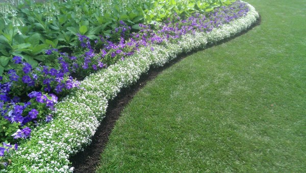
Each curve should be there for a reason. Like a walkway curving around a tree or bush. There's nothing wrong with curves off a straight line, but try for long, flowing, gradual curves over abrupt sharp ones, or the rhythm will be lost.
This is not just an external concept either. The same thing goes for
things you plant within the garden whether it's a single line of shrubs,
or staggered plantings with different shapes and heights. Having them
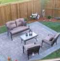
closely follow the same lines brings unity to your garden like the one shown above.
Keep things simple
Don't confuse the eye with your garden design. Simplicity is a basic design principle we've covered on our site already. When designing a garden, you may have to exercise some restraint with your wants. Introducing too many different types of plants, colours, or features can negatively affect your design by confusing the eye. A great way to design a garden is to keep it simple at first and add things down the road if you like.
The key to having achieving simplicity is by avoiding unnecessary
change or excess yet still avoiding monotony. It's a
balance that you may have to find on your own over time.
Proportion
Proportion is all about size relationships between buildings, people, plants, trees, masses and voids. Features must be in balance with one another vertically, horizontally, and spatially. The size of the garden design in relation to the size of the yard should be proportionate as should the size of everything in the bed to the surroundings of the yard. This is especially important with tree selection.
It's easier to keep things in proportion when you are dealing with
fixed features like a statue or a fountain. Growing things are a
little more difficult. You may not know or plan for how big or tall
something will grow. This will affect the overall balance of the
design.
Colour
No, it's spelled right. I'm from north of the border. So what do colours do? They can actually have multiple functions in a garden. First of all they can represent and create moods and feelings. They can draw or catch the eye. They can create dimension. Bright colours (Red, yellow, orange, etc..), actually appear to move closer to you than cooler colours (Blues and pastels), which appear to move away from you. Greys, blacks and whites are more neutral.
Lastly, colours can be used to make smoother transitions from one
feature to the next in your whole yard. You can work with any of
these functions of colour to achieve the effect you are looking for.
Balance
Balance refers to the equality, or proportions of different elements as seen by one's view.
There are 3 main types of balance in landscaping. The first one most of us are familiar with already. Symmetrical balance would be the perfect balance on either side. (Equality.) If your view was that of a garden bed on either side of the front door, they would have the same features mirror imaging each other in size, shape, height and colour.
The second one is asymmetrical balance. We've all seen it, but many of us are not quite as familiar with the term. The elements don't have to be a mirror image of one another, but the elements need only to have similar shape and size. (Proportion.)
The third type is called distal. This would be your near/far, or here/there balance. Distal balance is often overlooked and is greatly affected by off property features in your yard. A good example would be the view looking out over a backyard in relation to a mountain range in the background. It's the here/there where balance can play the most important role when it comes to designing.
Each time the view changes, it affects the overall balance of the design. Unlike something on paper, your design must be considered from every angle you can view it from. This is actually what makes designing a front yard garden bed for a corner lot even more challenging than a typical front yard garden bed against a house. There is an additional 90 degree view to account for that will affect the balance of the elements in the garden.
Present and future view
Understanding balance and how the view changes is very helpful in having an appealing garden. Now you can design your garden while considering how it will look from every possible viewpoint, but how will it look in the future? What will be the matured height and size of the trees, shrubs, and other elements? The future view must also be considered.
Form
Form isn't on my traditional list of design principles. It is something that has been interpreted different ways. Form in this context are aspects of the design that give a 3 dimensional mass. This is a good focus to have if you are considering winterscaping. They can give your garden 4 season appeal or life especially when colour is lacking and the leaves have fallen. Form can be provided by conifers, structures, hardscaping features, boulders, stone walls, etc... These are all things that can add interest throughout the year.
Unity
Unity is achieved when all, or most of the design principle have been followed, but there are 2 more important principles to finish this off. they sometimes appear on their own, but they are really the key ingredients to unity.
Repetition is the first one and can be linked to simplicity. Repeating shapes, plants or colours to avoid a cluttered look. This leads into the second key for achieving unity.
Transition is the ability to move the eye throughout the design smoothly. Whether you're using colour, shape, or size, abrupt changes will affect the unity of the design. Transition should be gradual.
Now you have a few helpful concepts to consider so let's throw a few tips at you. Here are a couple of ways to help you dig you garden beds with nice clean lines. The first one we covered. Using inverted marking paint. The second one is by using a flexible garden hose. It's a great way to design a bed while being able to make adjustments.
If you are looking for help on how to make a straight garden edge, this is a simple way to do it
. Use a board, or
piece of pipe when you dig your edge so you don't stray off track.
Good luck with your dream yard.
Dream Yard team
Return to dream yard home page from garden designing.
Check out our time and money saving e-book
How to avoid the biggest mistakes made by DIYers, designers, and landscaping companies.
Visitor
Favorites
Giggles 'n' Thoughts
